
Why We Scrapped Our Experience-Driven Website
There's nothing quite like the crushing realisation that your masterpiece is actually a magnificent failure. That's exactly what happened to us at ThinkStory when we finally faced the truth about our old website—it was stunning, praised by everyone who saw it, and absolutely terrible at doing what websites are supposed to do: convert visitors into clients.
The story begins with ambition. We wanted to create something that broke the mould, something that would make people stop scrolling and pay attention. And by all accounts, we succeeded. Our old site was a visual feast—full-height sections that snapped into place as you scrolled, cinematic full-width videos that played across entire screens, and an immersive experience that felt more like browsing through a digital art gallery than visiting a business website.
The feedback was intoxicating. "This is incredible," clients would tell us. "I've never seen anything like it." Design peers shared it in their inspiration folders. We'd built something that truly stood out in the crowded digital landscape of South African creative agencies.
But here's the uncomfortable truth we discovered: beautiful doesn't always mean effective.
The Reality Behind the Pretty Interface
While we were basking in the glow of aesthetic praise, our analytics were telling a very different story. The full-height snap scroll sections that created such a dramatic effect were actually trapping our visitors. Users couldn't freely navigate through our content. They were locked into viewing one section at a time, forced to scroll through our predetermined journey whether they wanted to or not.
The problems compounded quickly. Our drop-off rates increased as users became frustrated with the restrictive navigation. Lead generation suffered because potential clients couldn't easily find contact information or service details. Most damaging of all, our conversion rates stagnated while our design praise grew.
We'd fallen into a common trap in the creative industry – designing for ourselves rather than our users. The snap-scrolling feature that seemed so innovative was actually fighting against years of learned web behaviour. Users expect to control their navigation experience, to scroll freely and find information on their own terms.
The Video Background Obsession
Our love affair with full-width video backgrounds was perhaps the most painful lesson of all. We'd invested heavily in creating these cinematic experiences, believing they would captivate visitors and draw them deeper into our story. The reality was far more sobering.
The issue wasn't that the videos were poorly made, because they were brilliant. The problem was that they prioritised spectacle over functionality. Users visiting our site weren't looking for entertainment; they were looking for solutions. They wanted to understand our services, see our work, and determine if we could help their business. Our beautiful videos were getting in the way of that discovery process.
This tension between creating an "experience" and driving conversions is something many creative agencies face, particularly in South Africa's competitive digital landscape. We were so focused on showcasing our creative capabilities that we forgot the fundamental purpose of a business website.
Making the Difficult Decision to Start Over
Admitting that our beloved website wasn't working required swallowing our pride. We'd invested months of creative energy and countless late nights perfecting every animation and transition. The site represented our vision of what a creative agency could be—bold, different, unforgettable.
But business reality demanded a different approach. We made the difficult decision to completely rebuild from scratch, asking ourselves a fundamentally different question: instead of "How can we impress visitors?" we started asking "How can we help visitors achieve their goals?"
The process taught us several crucial lessons. First, user control is non-negotiable. Modern web users expect to navigate freely through content, and any design element that restricts this freedom will hurt your results. Second, every design decision should serve a business purpose. That doesn't mean websites need to be boring—it means every creative element should either help users find information or guide them toward conversion.
The New ThinkStory
Our rebuilt website at thinkstory.co.za represents a complete philosophical shift. The transformation is dramatic. Gone are the full-height snap sections that trapped users in our predetermined journey. Instead, we've implemented clear, intuitive navigation that lets people find exactly what they're looking for. The cinematic video backgrounds have been replaced with purposeful content that guides visitors toward conversion points.
The new design is still distinctly ThinkStory. It's clean, professional, and reflects our creative capabilities. But every element serves a clear purpose in the user journey. Navigation is straightforward and responsive across all devices. Content is organised to help visitors quickly understand our services and see relevant case studies. Contact forms and conversion points are easily accessible without interrupting the user experience.
Most importantly, visitors can control their own journey through the site rather than being forced down our predetermined path. We've maintained visual appeal while prioritising functionality, proving that you don't have to choose between beautiful design and effective conversion.
The Bottom Line: Purpose Over Perfection
Building our original website taught us that it's possible to create something that's simultaneously beautiful and ineffective. The design community's praise felt wonderful, but it didn't translate into business growth. Sometimes the most difficult decision is abandoning something you're proud of in favour of something that actually works.
For other creative agencies and businesses facing similar decisions, the lesson is clear: your website's primary job is to serve your business goals, not your creative ambitions. That doesn't mean sacrificing all personality or visual appeal—it means ensuring that every design choice supports the user's journey toward conversion.
We've just launched our new approach, and while it's too early for concrete metrics, the shift in thinking has already changed how we approach every design decision. Sometimes the most beautiful thing about a website isn't how it looks—it's how effectively it works for both the business and its users.


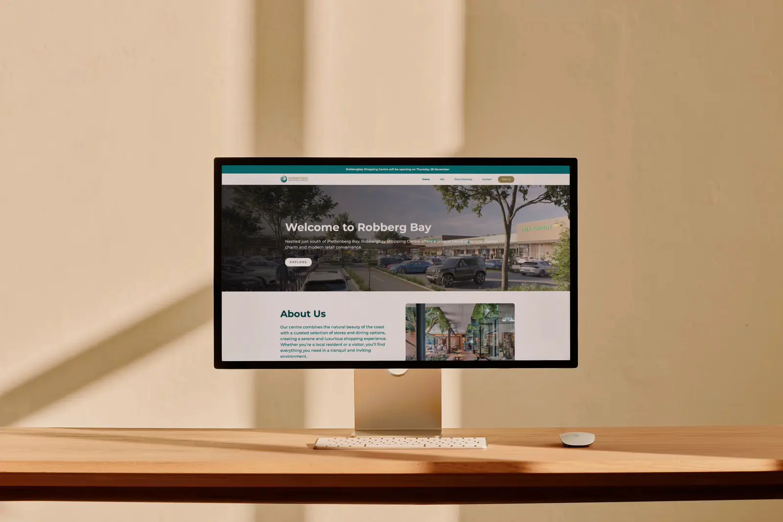
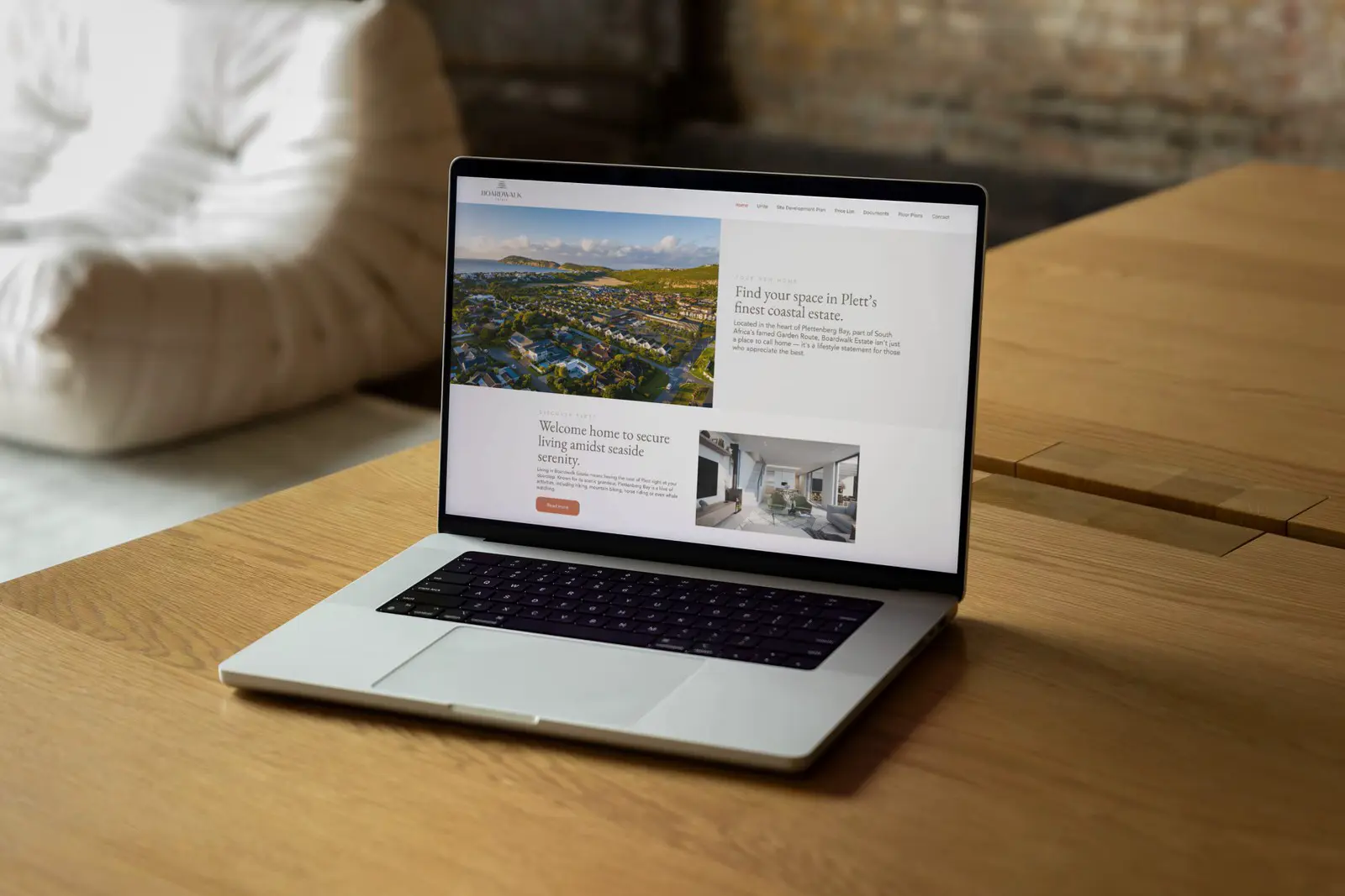
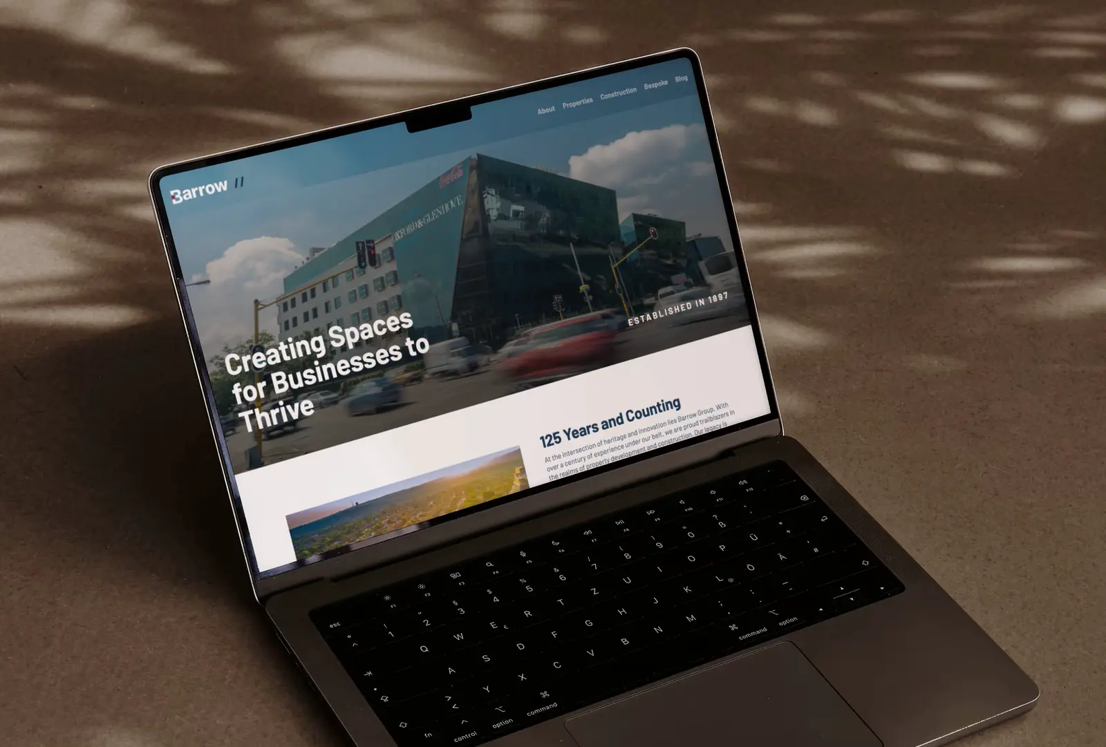
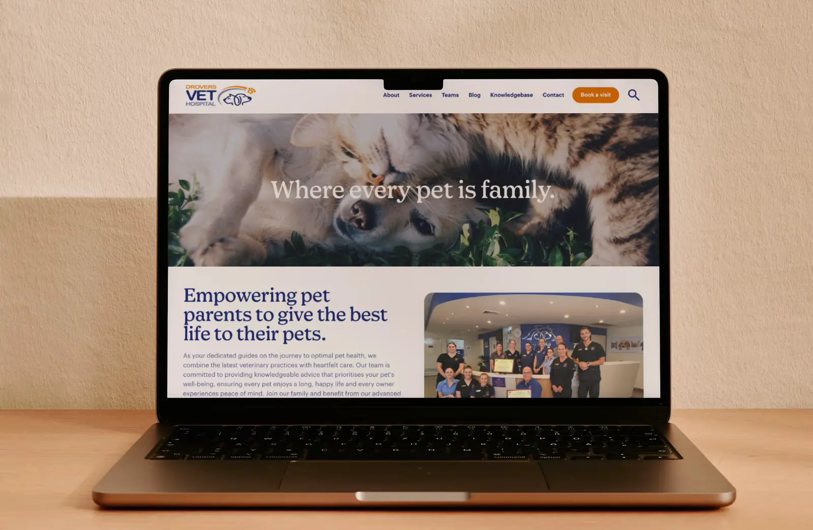
Read Similar Success Stories
Discover how other businesses have transformed their marketing challenges into growth opportunities through strategic partnerships with us.


.webp)
Ready to stop struggling with your marketing?
Book a 20-minute call today and discover how clear communication can transform your business.